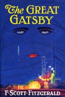
 Book design has been all the rage for a while now. I think it’s completely reasonable to trace the trajectory of that rage along with the rise of the design-obsessed McSweeney’s over the past decade. Professionals might disagree. In any case, new design projects have been legion so far this century: There’s Penguin’s graphic-art covers for classics; Penguin’s Great Ideas series; Harper Perennial’s Olive Editions; and the lovely unity of the NYRB Classics. Among many others.
Given all this, I’m wondering why no one has reimagined The Great Gatsby. The cover has thrived since it was created in the mid-1920s by Francis Cugat, who was commissioned to make it for the book. Fitzgerald loved it, and I’m sure many designers do, too. I just think it’s tacky. The deep red and blue, the green tear falling, the nude figures reflected in the eyes. Especially uninviting is the most prominent current edition, which features a white border around the original image.
Does anyone else think this American classic could use a new look? Any other books that are overdue for a makeover?

